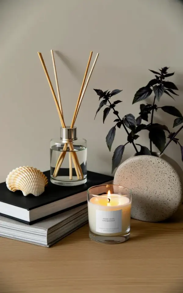
It’s funny how a bare corner can feel like a finished room one day and an empty void the next. I had that exact spot on my light wooden sideboard, the one between the window and the armchair, and it was just floating there, doing absolutely nothing for the space. Then I placed a clear glass reed diffuser front and center, piled a few books beside it, and suddenly the whole area had a pulse. This is the kind of **ReedDiffuserDecor** project that takes about four minutes, costs nothing extra if you already own a few bits and bobs, and changes how the room feels the second you walk in.
The photo that started this little styling session shows exactly what I mean. On the left, a beige seashell sits on top of two stacked hardcovers, one black, one gray. In the middle, a white candle in a plain glass holder burns softly, pushing warm light against the diffuser’s reeds. And on the right, a round speckled gray ceramic vase holds a cluster of purple basil flowers with dark green leaves, adding a bit of living chaos to all that calm structure. It wasn’t a grand redesign. It was just a matter of putting things together that already made sense.
### 1. Gather the Base Pieces First, Not the Decorations
Most people start with the cute stuff, the shells, the little sculptures, the dried flowers, and then they try to make it fit. I do the opposite. I start with the heavy visual anchors, the books and the main vessel, and let everything else act as a supporting cast.
For this arrangement, the vertical lines of the reed stems are the tallest element, so they set the rhythm. The stacked books on the left give the eye a solid block of color and texture to rest on before moving across to the candle and then the flowers. If you are trying this at home, look for objects that genuinely mean something to you. A stack of books you actually read, a shell you found on a trip, a vase you bought at a market because you couldn’t leave without it. That history is what makes the shelf feel personal instead of staged.
### 2. Build the Arrangement Like a Simple Recipe, One Layer at a Time
Ok so here is the practical method, and honestly it works for any flat surface, a mantel, a console table, a windowsill. You are aiming for a triangle shape when you look at the whole setup from the front. The diffuser is the tallest point, the books and the vase create the lower corners, and the candle fills the gap in the middle.
Try this order for the exact before and after look:
– Place the stack of books on the left, slightly offset from the edge of the surface.
– Set a small object on top of the books, a shell, a geode, a vintage watch, something with a little weight to it. That object breaks up the rectangle and adds a second layer of height.
– Position the candle in the center, pulled a few inches forward so it overlaps the books and the vase just slightly. This overlap is what creates depth, flat rows of items never feel cozy.
– Put the vase on the right, not too close to the candle, leave about a hand’s width of breathing room.
– Let the diffuser stand slightly back and center, so the reeds fan out behind the candle flame and the glass catches the light.
### 3. Choose the Right Spot for the Diffuser Itself
Here’s the thing about reed diffusers: they need air movement to work, but they also need to look like they belong. I used to hide mine near the front door where nobody would knock it over, but it kept collecting dust and felt like an afterthought. Moving it to the center of this stack styling session was a total game changer.
A clear glass vessel is your best friend for this, especially if you are going for a minimalist shelf. The amber oil inside becomes part of the palette, mixing with the wooden sticks and the neutral background. If your diffuser is in a colored or plastic bottle, sit it on top of a single book or a small ceramic coaster to give it a little elevation. That simple lift separates it from the book surface and makes it feel intentional instead of just placed there.
### 4. Mix Natural Textures With Hard, Geometric Lines
Minimalists don’t mean empty, we mean edited. The whole corner works because the textures are all over the place. You have the smooth glass of the diffuser, the matte, rough cover of a black hardback, the gritty speckle of the gray vase, the soft petals of the basil flowers, and the rigid, dry texture of the reed sticks.
If everything is smooth and perfect, the eye gets bored. If everything is textured and rustic, it turns into clutter. The trick is to pair one polished object with two organic ones. The black and gray books give a graphic, almost brutalist feel, and then the seashell and the purple basil soften that right up. That contrast is the difference between a staged shelf and a lived-in one.
### 5. Give the Styling a Real World Purpose, Not Just a Good Look
Do not arrange this corner and then walk away. Light the candle so the flame flickers against the glass reeds and throws a moving shadow across the back wall. Flip the reeds every few days, but here’s a practical tip: don’t flip them while they’re in the middle of a styled arrangement. Take them out one by one, flip them, and put them back in the same spot. Yes, it’s tedious, but it keeps the look balanced and the oil fresh.
One harmless accident taught me to check the glass vessel for dust before flipping the sticks. A little spec of dust stuck to a wet reed will end up floating in the oil and make the whole thing look murky. So wipe the glass with a dry cloth before you touch the reeds. It takes nine seconds and saves you the hassle of trying to fish dust out of a narrow cylinder.
### 6. The Shelf Styling Rules That Apply to Any Shelf
There are a few **ShelfStyling** rules that make this exact arrangement reproducible. I stick to them even when I feel like breaking them, because they have saved me from countless design dead ends.
– Odd numbers always look better than even numbers. Here, the visual count is three main objects: the books, the candle, and the vase. The diffuser is the center anchor, but it reads as the tall, calm top of the triangle.
– Vary your heights dramatically. If everything is the same height, the shelf looks like a lineup of soldiers. The reeds are tall, the candle is medium, and the books are low. Punchy contrast.
– Leave negative space. You don’t have to fill every inch. The empty air between the vase and the candle is just as important as the objects themselves.
– Don’t center everything. Off-center objects are dynamic. Centered objects feel heavy and formal.
### 7. Why the Aromatic Home Needs This Kind of Visual Anchor
We talk a lot about scent, but the visual side of aromatherapy matters too. If the diffuser is buried behind clutter or sitting in a dingy corner, you won’t notice it, and you won’t replace the oil on time. Putting it where you can see it, front and center, shortens the path between you and that calming ritual.
That’s the real takeaway here: a diffuser isn’t just a functional item that quietly does its job. It is part of the room’s atmosphere. When you place it on a stack of books with a candle and some flowers, you are telling your brain, this is a calm space, slow down, breathe in. The scent does the heavy lifting, but the styling gives it a visual stage to work from.
### 8. How to Adjust This For a Different Season or Vibe
You don’t need to copy this exact setup forever. Swap the purple basil for dried wheat in the fall, or a sprig of eucalyptus in the winter. Change the seashell for a small polished stone. Move the candle to the left and the books to the right. The formula stays the same, the objects change, and the corner feels fresh without a full redesign.
For a darker, moodier space, use a black vase instead of the speckled gray one and stack more leather-bound books. For a light, airy coastal room, swap the black and gray books for white linen-covered ones and add a second shell. The point is to work with what you have and let the season or your mood dictate the final touch.
### The Before and After Is Not About Buying New Stuff
Look, the real lesson in this before and after is that you already own what you need. The bare corner looked dull because everything was piled in one spot or hidden away. The upgraded corner works because the diffuser, the candle, the books, and the flowers all share the same visual weight and get a chance to breathe.
Give it a try, seriously. Take a diffuser you already have, set it on a stack of books near a candle, and see what happens to that empty spot you’ve been ignoring. If you do a little styling swap today, I’d love to hear how it turned out. What’s your favorite aromatherapy decor trick, and where does your diffuser live in your home?
Leave a Comment