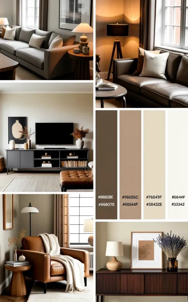
I’ve been staring at this neutral living room mood board for days, and honestly, it’s exactly the kind of calm, collected space I want to curl up in. But here’s the thing: putting together a cohesive beige, gray, and brown palette is way trickier than it looks. Most people mess it up by going too matchy-matchy or too cold. So let me walk you through the common mistakes (and how I’d fix them) using this specific mood board as our guide. Because a neutral living room mood board should feel warm and intentional, not like a doctor’s waiting room.
Mistake 1: Sticking to one shade of beige until the room feels flat
I see it all the time. Someone decides on “beige” and buys everything in the exact same undertone. Snooze fest. This mood board gets it right by mixing several beiges: the cream throw pillows on that gray sectional have a slightly warmer undertone than the white throw blanket on the brown armchair. Little differences like that create depth.
What you actually want is a range from off-white to oatmeal to a deeper biscuit. Not all at once, but three distinct stops. Look at the collage: the plush brown armchair sits next to the lighter gray sectional, and the white throw blanket breaks up the brown. That contrast is what saves it from looking like a box of chalk.
One weird trick I swear by: hold your fabric swatches against a plain piece of printer paper. If they all look identical, you need more variety. If one looks slightly yellow or pink next to the paper, that’s actually good. You want subtle shifts, not a single flat line.
Mistake 2: Forgetting that gray can read cold without something warm nearby
That gray sectional in the top image? On its own it could lean a little clinical. But the dark wood floor lamp and the brown armchair anchor it in warmth. Gray is a tricky beast. It’s like a chameleon: put it next to blue-gray and it looks purple; put it next to beige and it turns cozy. This mood board uses a medium warm gray, not a cool steel gray. That’s the secret.
Here’s a practical rule: if your gray has visible blue undertones (look at it in natural light), you need at least one piece of wood furniture within sight. The modern media console with black shelving in this board has black framing but the shelving itself holds warm-toned books and decor. That little injection of wood tone (even indirect) saves the whole color story. Skip that and your neutral living room mood board becomes a prison of grey.
Mistake 3: Piling on textures without a plan (result: visual chaos)
Ok so textures are good. But throwing a chunky knit blanket, a linen pillow, a leather chair, and a velvet ottoman in the same room without rhyme or reason? That’s not cozy, that’s a craft store explosion. This mood board sticks to four textures: the soft boucle-like feel of the cream pillows, the smooth leather or chenille of the brown armchair, the woven blanket, and the hard glossy finish of the black shelving. That’s it.
Keep your texture count between three and five. And if you’re blending them, make sure at least two are matte. The dark wood floor lamp is matte. The media console shelves are matte black. That keeps things grounded. The only glossy element in this whole board is a small decorative vase I can see on the console. One glossy piece, no more. Here’s a quick checklist:
- One soft, fluffy texture (throw blanket, rug, pillow)
- One smooth, solid texture (leather armchair, linen sofa)
- One hard, sleek texture (lamp base, console legs, picture frames)
- Optional fourth: woven or nubby (basket, wool throw)
- Avoid using three different knit patterns unless you want to live in a sweater
Mistake 4: Letting the media console dominate the room (black shelving is a bully if you let it)
That modern media console with black open shelving is a showstopper. But honestly, black furniture can be a tyrant. It draws your eye immediately and makes everything else feel smaller. The mood board handles this by keeping the console low and horizontal, and by layering lighter items on the shelves – books with white covers, a neutral ceramic piece. You don’t want a black wall of void.
If you have dark shelving, do not fill it with dark objects. That’s like wearing a black shirt with black pants and black shoes. You disappear. Instead, use the shelves to display cream pottery, beige books, and maybe one small plant. The white throw blanket on the brown armchair across the room balances the weight of the black console. It’s a tug-of-war, and you need both sides to pull equally.
And here’s a tangent: I once bought a black media cabinet without measuring the depth. It stuck out two inches past the wall, and every time I walked past I hit my shin. For six months. So measure twice, and keep that console flush with the wall or at least the same depth as your sofa. Your shins will thank me.
Mistake 5: Under-lighting the room (one floor lamp is not enough)
Look, the dark wood floor lamp in this mood board is gorgeous. I want one. But a single floor lamp, even a great one, won’t light an entire neutral living room. Beige and gray walls absorb light differently. Beige reflects warmth but can look dingy if under-lit. Gray eats light. So you need at least two light sources in different zones: the floor lamp near the sectional, and maybe a table lamp on the media console or a small lamp on a side table next to the brown armchair.
The mood board shows the lamp next to the sofa, but there’s no visible ceiling fixture. That’s fine for a rendering, but in real life, you’d want layered lighting. Ambient light from a ceiling fixture or track lighting, task light from the floor lamp for reading, and accent lights to highlight the art or the shelving. Otherwise your beautiful neutral palette turns into a mud puddle after sunset.
Mistake 6: Making the armchair an island (that plush brown chair needs friends)
That brown armchair with the white throw blanket is gorgeous, but if you just plop it in a corner alone, it looks like an afterthought. This mood board places it close enough to the gray sectional that they visually connect. In a real room, you’d put a small side table or a footstool next to it. Or angle it slightly toward the sofa to create a conversation zone.
I’ve seen people buy a stunning accent chair and then leave it three feet away from everything. Nobody sits there. It becomes a coat hanger. Give it a purpose. In this case, the white throw blanket on the chair ties it to the cream pillows on the sectional. That little visual link is enough to make the whole layout feel like one room, not two separate furniture store displays. If you’re working with a similar setup, add a small round tray table between the chair and sofa. Boom. Cohesion.
Mistake 7: Ignoring the floor (the ground is part of the mood board too)
This mood board doesn’t show a rug, but that’s a missed opportunity. A neutral space needs a rug more than a colorful room does. Why? Because beige and gray are quiet, and without a rug to define the seating area, everything floats in a sea of bare floor. A large jute rug with a subtle gray border would perfectly bridge the sectional and the armchair. Or a low-pile cream rug with a faint geometric pattern in brown.
Here’s a tiny personal gripe: I once skipped a rug because I thought “the floor is already neutral.” Wrong. The room felt like a waiting room. I ended up buying a cheap woven rug from IKEA and everything clicked into place. Rugs absorb sound, add texture, and physically anchor your furniture. If your mood board doesn’t include one, mentally add a 8×10 rectangle in a light beige with a darker edge. You’ll feel the difference.
Building a neutral living room mood board isn’t about copying a photo pixel for pixel. It’s about understanding why each piece works. The gray sectional with cream pillows sets the soft base. The dark wood floor lamp adds a vertical warm note. The black shelving gives structure. The brown armchair with the white throw brings depth and a place to actually sit. And the whole thing stays out of beige boring land by mixing undertones, limiting textures, and lighting it properly. Honestly, I’m saving this mood board for my own next apartment. If you do too, just avoid those seven mistakes and your room will feel as calm as that collage looks.
Ready to pull together your own version? Start with one anchor piece (maybe the sectional or the chair) and build outward from there. And for the love of good design, measure your floor lamp’s base width first. Save this post or pin it so you don’t forget the wood-and-black rule. Your living room will thank you after sunset.
#NeutralLivingRoom #MoodBoard #CozyHome #LivingRoomDecor #NeutralDecor
Leave a Comment